


ASTRO
ROLE
PRODUCT DESIGN, UI/UX
SERVICE
SPACE OPS
INDUSTRY
CONCEPT
YEAR
2023
( LUNAR SOUTH POLE )
OVERVIEW
NASA AND SPACEX BUILD INTERFACES FOR ENGINEERS. ASTRO ASKS A DIFFERENT QUESTION — WHAT IF MISSION CONTROL WERE DESIGNED WITH THE SAME CARE AS A CONSUMER PRODUCT? A MONITORING DASHBOARD FOR A SIX-PERSON LUNAR CREW, WHERE CALM IS A DESIGN REQUIREMENT.
NASA AND SPACEX BUILD INTERFACES FOR ENGINEERS. ASTRO ASKS A DIFFERENT QUESTION — WHAT IF MISSION CONTROL WERE DESIGNED WITH THE SAME CARE AS A CONSUMER PRODUCT? A MONITORING DASHBOARD FOR A SIX-PERSON LUNAR CREW, WHERE CALM IS A DESIGN REQUIREMENT.
NASA AND SPACEX BUILD INTERFACES FOR ENGINEERS. ASTRO ASKS A DIFFERENT QUESTION — WHAT IF MISSION CONTROL WERE DESIGNED WITH THE SAME CARE AS A CONSUMER PRODUCT? A MONITORING DASHBOARD FOR A SIX-PERSON LUNAR CREW, WHERE CALM IS A DESIGN REQUIREMENT.
SOLUTION
I MAPPED HOW OPERATORS ACTUALLY DECIDE UNDER PRESSURE — AND REBUILT THE HIERARCHY AROUND URGENCY, NOT DATA CATEGORIES. THE RESULT: AN INTERFACE THAT STAYS CALM SO THAT WHEN SOMETHING BREAKS, THE BREAK IS THE LOUDEST THING ON SCREEN.
I MAPPED HOW OPERATORS ACTUALLY DECIDE UNDER PRESSURE — AND REBUILT THE HIERARCHY AROUND URGENCY, NOT DATA CATEGORIES. THE RESULT: AN INTERFACE THAT STAYS CALM SO THAT WHEN SOMETHING BREAKS, THE BREAK IS THE LOUDEST THING ON SCREEN.
I MAPPED HOW OPERATORS ACTUALLY DECIDE UNDER PRESSURE — AND REBUILT THE HIERARCHY AROUND URGENCY, NOT DATA CATEGORIES. THE RESULT: AN INTERFACE THAT STAYS CALM SO THAT WHEN SOMETHING BREAKS, THE BREAK IS THE LOUDEST THING ON SCREEN.
MISSION.
MISSION.
MISSION.
OVERVIEW
Mission control, designed like a product people actually use
ASTRO is a self-initiated concept built around a single provocation: NASA and SpaceX build interfaces for engineers — but what if mission control were designed with the same care as a consumer product?
The scenario: a six-person crew on a lunar south pole mission, monitored by a ground team managing simultaneous feeds of health data, mission performance, and crew psychology. In an emergency, every second spent interpreting the interface is a second not spent responding to it.
Mission control, designed like a product people actually use
ASTRO is a self-initiated concept built around a single provocation: NASA and SpaceX build interfaces for engineers — but what if mission control were designed with the same care as a consumer product?
The scenario: a six-person crew on a lunar south pole mission, monitored by a ground team managing simultaneous feeds of health data, mission performance, and crew psychology. In an emergency, every second spent interpreting the interface is a second not spent responding to it.
CHALLENGE
Dashboards that fail exactly when they matter most
Existing mission dashboards collapse under pressure. Dense tables, competing hierarchies, and inconsistent visual weight increase cognitive load at precisely the moment it needs to be lowest. And there's a dimension standard dashboards ignore entirely: morale. On long-duration missions, crew mental health is as operationally critical as oxygen levels — yet it lives in a separate system, if it's tracked at all.
Dashboards that fail exactly when they matter most
Existing mission dashboards collapse under pressure. Dense tables, competing hierarchies, and inconsistent visual weight increase cognitive load at precisely the moment it needs to be lowest. And there's a dimension standard dashboards ignore entirely: morale. On long-duration missions, crew mental health is as operationally critical as oxygen levels — yet it lives in a separate system, if it's tracked at all.
GOALS
Lower the cost of understanding
The brief I set myself had one measure of success: reduce the time between glancing at the screen and knowing what to do. That meant designing for two opposite states with one system — hours of calm monitoring where nothing should demand attention, and seconds of crisis where the right thing must demand all of it.
Lower the cost of understanding
The brief I set myself had one measure of success: reduce the time between glancing at the screen and knowing what to do. That meant designing for two opposite states with one system — hours of calm monitoring where nothing should demand attention, and seconds of crisis where the right thing must demand all of it.

PROCESS
Mapping decisions, not data
The design started with one question: what does the operator need to know first? I mapped the ground team's decision tree during a simulated anomaly — what they check, in what order, and where current interfaces slow them down.
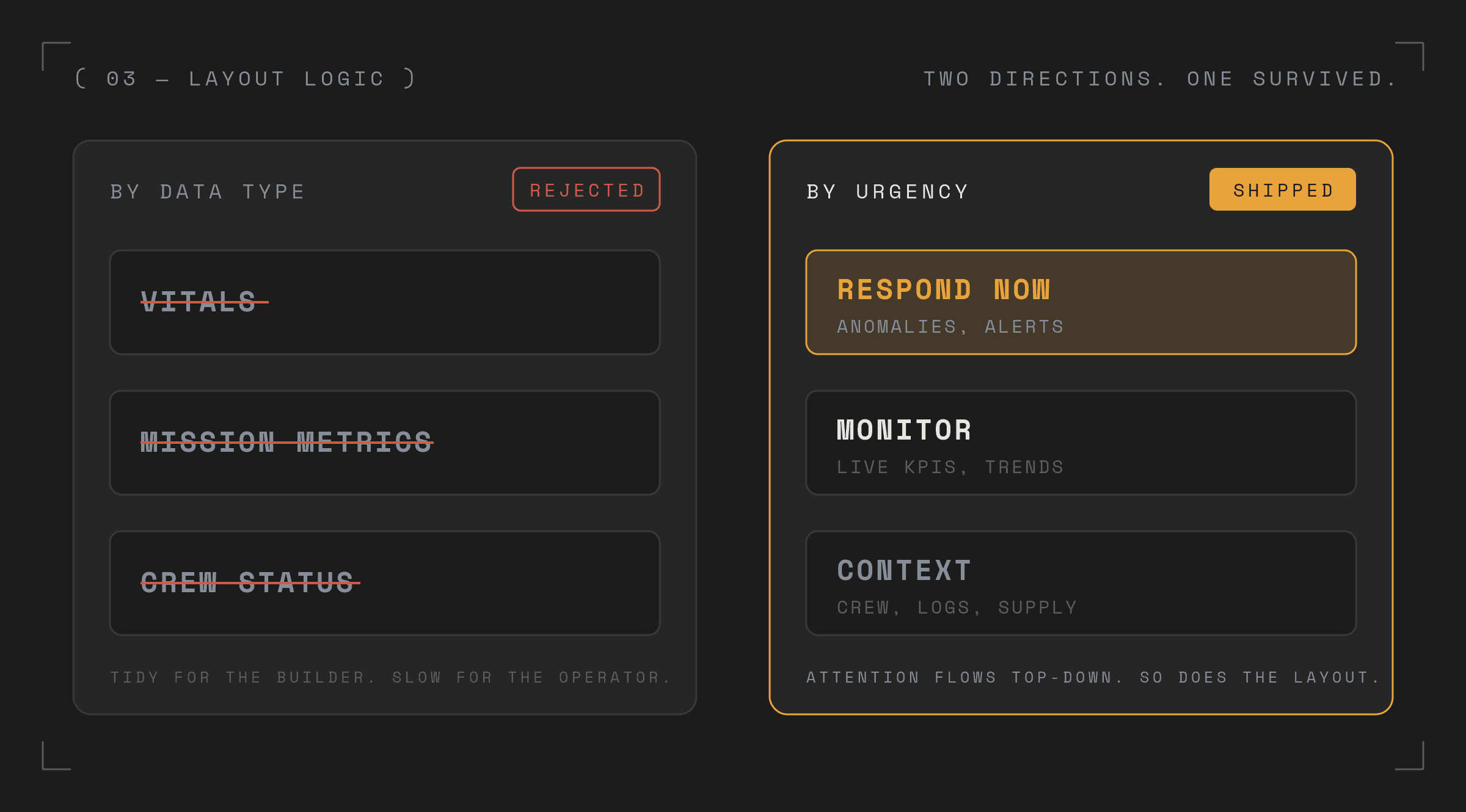
Several early directions organized the layout by data type — vitals together, mission metrics together. They were faster to build and easier to explain. They were also wrong. Operators don't think in data categories; they think in urgency. The layout had to reflect that.
Mapping decisions, not data
The design started with one question: what does the operator need to know first? I mapped the ground team's decision tree during a simulated anomaly — what they check, in what order, and where current interfaces slow them down.
Several early directions organized the layout by data type — vitals together, mission metrics together. They were faster to build and easier to explain. They were also wrong. Operators don't think in data categories; they think in urgency. The layout had to reflect that.


DESIGN DECISIONS
Calm as a baseline, so anomalies scream
Dark mode is functional, not aesthetic — it reduces eye fatigue across long shifts and improves data contrast. The three-column layout separates concerns deliberately: navigation organized by decision type, time-sensitive KPIs as scannable cards in the center, contextual detail on the right — present, but never demanding constant attention.
The most deliberate choice: the crew morale score sits next to heart rate and oxygen — not in a separate wellbeing module, not buried in a crew tab. Psychological monitoring belongs inside mission health, not beside it.
Calm as a baseline, so anomalies scream
Dark mode is functional, not aesthetic — it reduces eye fatigue across long shifts and improves data contrast. The three-column layout separates concerns deliberately: navigation organized by decision type, time-sensitive KPIs as scannable cards in the center, contextual detail on the right — present, but never demanding constant attention.
The most deliberate choice: the crew morale score sits next to heart rate and oxygen — not in a separate wellbeing module, not buried in a crew tab. Psychological monitoring belongs inside mission health, not beside it.
IMPACT
A calmer operator, making faster calls
Testing the hierarchy with designers and engineers, anomalies were identified faster and with less back-and-forth than on reference dashboards. But the response that came up most consistently wasn't about speed — it was about feeling: the interface felt in control, even when the data didn't. That's the real design goal. Not just faster decisions — a calmer operator making them.
A calmer operator, making faster calls
Testing the hierarchy with designers and engineers, anomalies were identified faster and with less back-and-forth than on reference dashboards. But the response that came up most consistently wasn't about speed — it was about feeling: the interface felt in control, even when the data didn't. That's the real design goal. Not just faster decisions — a calmer operator making them.


Figma · UX Research · Wireframing · UI Design · Responsive Design · Framer
Figma · UX Research · Wireframing · UI Design · Responsive Design · Framer


