

ONE TAB
ROLE
PRODUCT DESIGNER · UI/UX
FOCUS
Focused Browsing · Content Discovery · UI/UX
CLIENT
CONCEPT
YEAR
2022
( CONCEPT )
OVERVIEW
A self-initiated concept for a calmer, smarter way to consume content across platforms — designed around focus, not engagement metrics.
A self-initiated concept for a calmer, smarter way to consume content across platforms — designed around focus, not engagement metrics.
SOLUTION
One quiet, editorial place to read — no badges, no counts, no urgency — where the intelligence is present but never loud.
One quiet, editorial place to read — no badges, no counts, no urgency — where the intelligence is present but never loud.
PROTOTYPE — IN DEVELOPMENT
PROTOTYPE — IN DEVELOPMENT
THE
NOISE.
OVERVIEW
Designing a calmer way to consume content
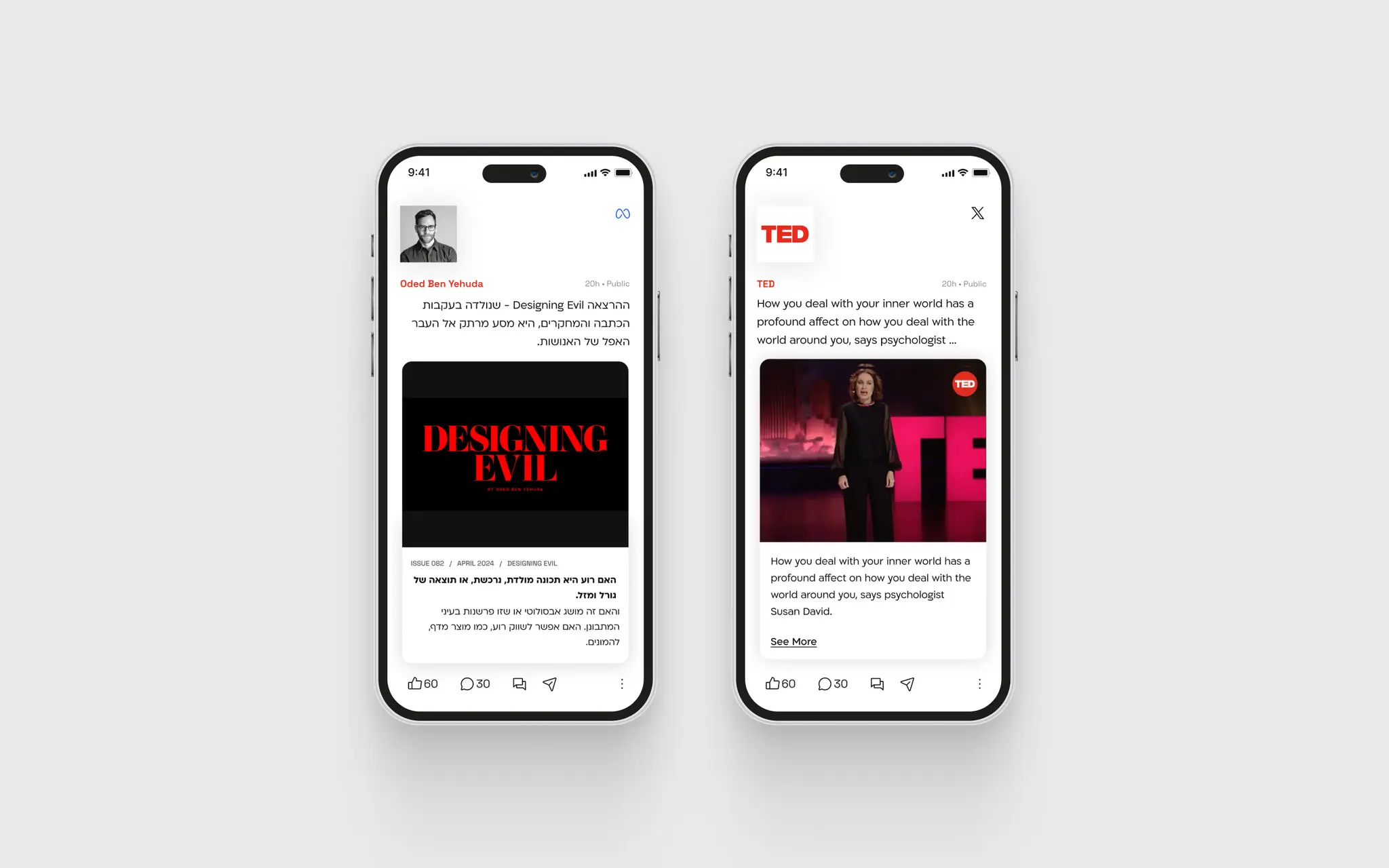
One Tab is a self-initiated concept exploring a problem that gets worse every year: the more content platforms exist, the harder it is to find something worth reading. Most people maintain four or five separate apps and spend more time switching between them than actually engaging with anything. The question: what would a content experience look like if it were designed around focus rather than engagement metrics?
Designing a calmer way to consume content
One Tab is a self-initiated concept exploring a problem that gets worse every year: the more content platforms exist, the harder it is to find something worth reading. Most people maintain four or five separate apps and spend more time switching between them than actually engaging with anything. The question: what would a content experience look like if it were designed around focus rather than engagement metrics?


CHALLENGE
Platforms optimised against the user
Existing platforms are optimised for time-on-app, not quality of experience. Infinite scroll, algorithmic anxiety, and notification pressure are features, not bugs — engineered to keep users in low-grade stimulation. The result: people feel overwhelmed, rarely finish what they start, and come away having consumed a lot while retaining very little. The design challenge wasn't just visual — it required taking a position on what a content app should actually be trying to do for its users.
Platforms optimised against the user
Existing platforms are optimised for time-on-app, not quality of experience. Infinite scroll, algorithmic anxiety, and notification pressure are features, not bugs — engineered to keep users in low-grade stimulation. The result: people feel overwhelmed, rarely finish what they start, and come away having consumed a lot while retaining very little. The design challenge wasn't just visual — it required taking a position on what a content app should actually be trying to do for its users.

THE
TEST.
PROCESS
Starting with the question, not the UI
Rather than redesigning an existing interface, I started by defining a set of anti-patterns to avoid. Every design decision had to pass a single test: does this serve the user's attention, or compete for it? That constraint shaped the information architecture, the motion language, and the intelligence layer before a single screen was drawn.
Starting with the question, not the UI
Rather than redesigning an existing interface, I started by defining a set of anti-patterns to avoid. Every design decision had to pass a single test: does this serve the user's attention, or compete for it? That constraint shaped the information architecture, the motion language, and the intelligence layer before a single screen was drawn.

THE
FOCUS.
DESIGN DECISIONS
Calm as a product decision
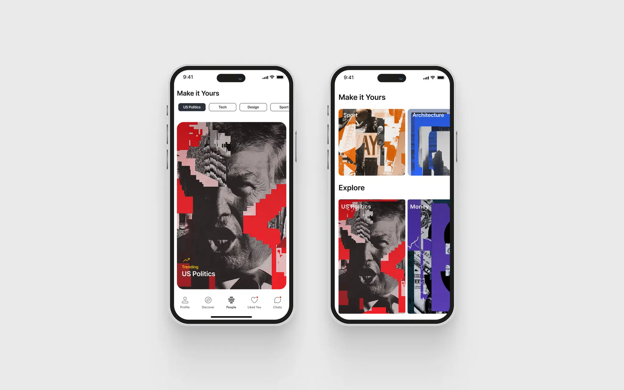
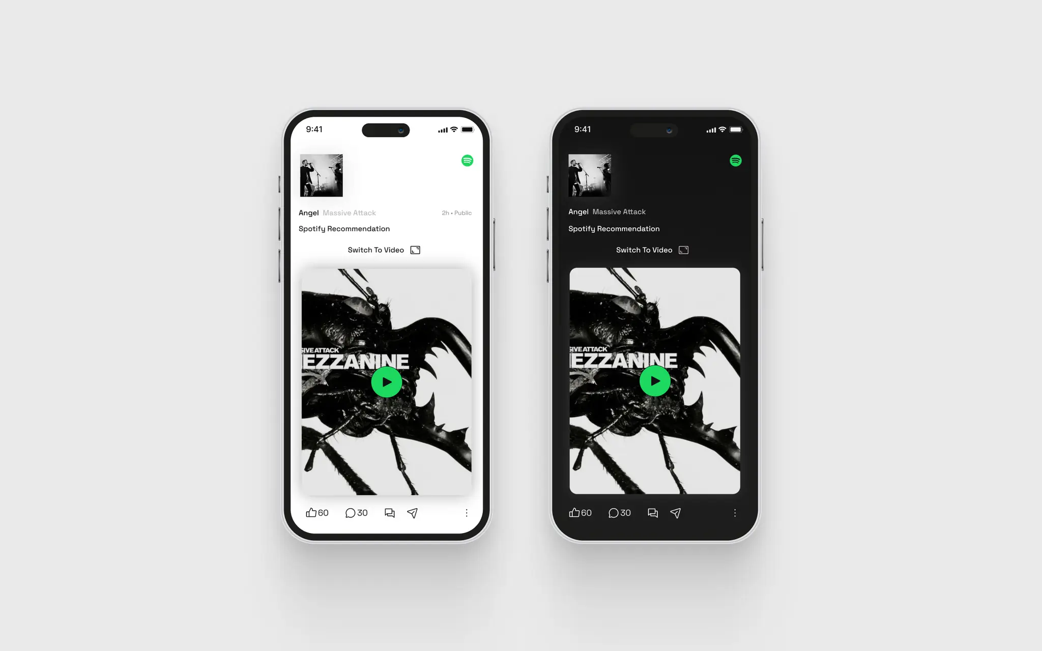
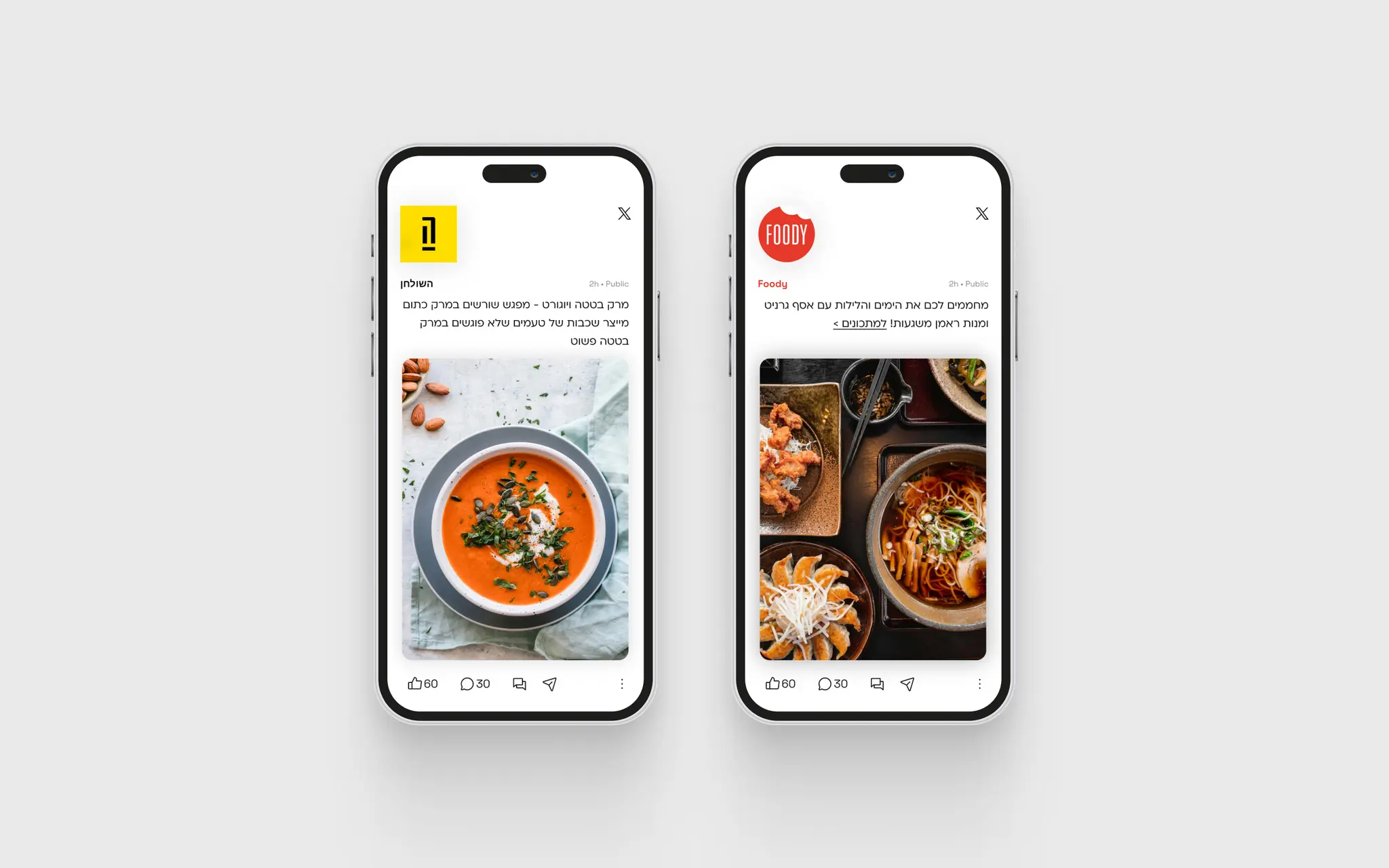
The visual language is built around calm as a product decision, not just an aesthetic one. Content cards use generous white space and editorial typography. No badges, no unread counts, no urgency cues — the interface communicates through quality of presentation, not quantity of notifications. Motion is physics-based and continuous, reinforcing a sense of moving through a space rather than scrolling a list. The intelligence layer is present but quiet — personalisation feels like a thoughtful recommendation, not a surveillance reveal.
Calm as a product decision
The visual language is built around calm as a product decision, not just an aesthetic one. Content cards use generous white space and editorial typography. No badges, no unread counts, no urgency cues — the interface communicates through quality of presentation, not quantity of notifications. Motion is physics-based and continuous, reinforcing a sense of moving through a space rather than scrolling a list. The intelligence layer is present but quiet — personalisation feels like a thoughtful recommendation, not a surveillance reveal.



THE
QUIET.
Outcome
FOCUS BY DESIGN
User testing pointed to improved focus during reading sessions — and one response kept coming up: the experience felt "calm yet dynamic." That pairing is harder to achieve than it sounds, and the feedback suggests it landed.
FOCUS BY DESIGN
User testing pointed to improved focus during reading sessions — and one response kept coming up: the experience felt "calm yet dynamic." That pairing is harder to achieve than it sounds, and the feedback suggests it landed.

PROTOTYPING · MOTION DESIGN · INTERACTION DESIGN · UX WRITING
PROTOTYPING · MOTION DESIGN · INTERACTION DESIGN · UX WRITING


